
Responsive web design is undoubtedly the single most important thing when it comes to websites in 2021.
Designing your website with a fluid and flexible layout in mind is the key to getting your business found online, increasing your SEO value, and driving conversions, no matter the business or industry you’re in.
What is mobile responsiveness?
Mobile responsiveness is a way of designing and developing a website so that it automatically adapts to the size of any screen that it’s being viewed on.
The aim is to provide a seamless user experience across all devices – from desktops and tablets to smartphones and everything in between. Not to be confused with mobile friendly websites, where previously sites would be designed in two separate versions – one for mobile and one for desktop – responsive web design takes the needs of all different devices into account.
So, why is it so important to have a responsive website?
In this blog, we’ll cover the key points of why it’s crucial that your website is responsive, and how you could be doing yourself a huge disservice if it isn’t.

1. User experience
Last year, there were more than 4.28 billion mobile internet users around the world, suggesting that approximately 90% of global web users accessed the internet through their phones.
While many of those users will have a balance between their devices, likely using their desktop computer and smartphone alternately depending on the situation, it does mean that there should be a large focus on your mobile users.
There’s been a huge shift in how websites are built in a relatively short space of time. Previously, websites would be designed solely for use on a computer – as technology progressed, some developers would create additional mobile sites, usually accessed via a URL like m.example.com. They didn’t automatically detect users’ devices though, meaning mobile web users would have to scroll awkwardly through the full size site and find a link to the mobile version.
We’ve moved on though, and in the early 2010s, mobile responsive web development was introduced. It means that sites can now adjust to the screen size of the user, regardless of the device they’re using. It’s a key way of providing a consistently strong user experience to all site visitors.
Incredibly, many dated sites still aren’t mobile friendly. While this wasn’t an issue in the past, consumers have become more tech-savvy – if they land on a website on their mobile that is difficult to use and geared only to desktop users, they’ll likely exit after just a few seconds and take their business elsewhere.
2. Mobile-first indexing
It’s not just users you have to worry about – Google’s indexing bots have also got an issue with sites that aren’t mobile friendly.
Google determines the positions of sites in their search results based on a huge number of factors, some more important than others. Factors can include loading speed, keyword density, and backlinks, with these creating a high demand for SEO to optimise websites for better organic rankings.
The factors that count towards your rankings can change quite regularly, and in July 2019 mobile responsiveness took centre stage. Mobile-first indexing was introduced at this time, meaning that for the first time, Google would analyse the mobile version of websites when indexing and ranking.
It means that sites that don’t provide a good user experience on mobile devices could end up heavily penalised, dropping down the rankings behind the sites of their more advanced competitors.
As such, it’s important to consider your mobile site performance as a key part of your SEO strategy. If you’re aiming to increase your search results position, you should take a thorough look at how your site works on mobile devices first.

Tips for optimising your site for mobile
When a customer lands on your website, there are a few standard things that they’re expecting to see straight away. The website should load quickly, the content should be displayed clearly, and it should be easy to navigate.
Here are a few simple ways to optimise your site for both the user and Google…
1. Click-to-call CTAs
If you haven’t already implemented click-to-call CTAs on your website, you might just be missing a trick. If mobile users want to contact you, they’ll need an easy way to get in touch.
Click-to-call CTAs are a great way of encouraging conversions from mobile users, as with just a click of a button, they’ll be able to dial straight through to your business. Not only will you increase your chances of making a new sale or generating a lead, you’ll also be multiplying the user’s experience. It’s a no-brainer.
2. Optimise images
High-quality imagery is vital to a website – whether that’s for showcasing your products in the best possible light, highlighting useful content or simply to add aesthetics to the overall design. However, it’s important that these images aren’t so high quality that they take up too much space on the server, and in turn, decrease page load times.
It’s important to get into the habit of optimising and compressing your images & videos before uploading them to your site. Manually resize your images to reduce the file size, and opt for faster-loading image formats such as JPGs for photos and PNGs for logos or anything with a transparent background.

3. Responsive typography
When it comes to optimising your site for mobile, responsive typography is a must. A nicely designed website isn’t much without its content, so it’s important to make sure that your text is displayed correctly and most importantly, readable, across devices.
For desktop-only sites, defining the pixel size of your font was always the way forward – but this won’t cut it on mobile. Utilise responsive font sizes that dynamically adjust according to the type and size of device it’s being used on.
4. Navigation menu
Undoubtedly the most important element of your website, the navigation menu is what will get your users from A to B. If you really want users to navigate around your site (and you should), make sure your menu is user friendly on mobile.
Having all of your main services and product pages clearly visible and linked across the top of your website is easy on desktop, but don’t try to cram this all in on mobile. It’s cluttered, difficult to navigate and will likely make users exit your site.
For ease of optimisation, consider implementing a hamburger menu. This is common enough amongst most websites nowadays that users generally know to click it in order to expand the menu. Make sure the icon is clear and obvious enough, and that it’s a clean transition which opens and closes with ease.
If you have any links which are deemed the most important and you want them to be prominent in front of your users, consider having these visible just below the header and reserve your hamburger menu for the remaining items.

Signs your site needs more mobile optimisation
So, now you know why mobile responsiveness is important for every website – but, how do you know if your website is responsive or not?
There are a few tell tale signs which can indicate that your website isn’t quite hitting the mark in terms of mobile responsiveness:
1. Increase in bounce rate
Have you noticed an increase in bounce rate? If so, this may indicate that users are put off when landing on your website.
Mobile users can be impatient, and don’t tend to take too kindly to websites that aren’t serving them the way they want. If your website isn’t easy to navigate, isn’t loading elements correctly and the content is hard to read, users are likely to jump straight off and on to one of your competitors sites instead.
2. Lack of conversions
We understand the struggles of putting your heart and soul into your marketing efforts and it not paying off. You’re driving users to your website and they’re not converting – why could that be?
The first thing you want to check is the mobile friendliness and general usability of your website. Make sure that all of your CTAs, contact forms, online booking systems, and checkouts display correctly on mobile and work with full functionality.
In today’s world, there’s a high likelihood that a large percentage of your potential customers are visiting your site on mobile – so your lack of mobile responsiveness could just be harming your sales.
3. Users leaving your website
An important thing to consider when optimising your mobile responsiveness is looking into the most common page users ‘drop off’. This simply means where users leave your site. Google Analytics offers this information in an Analytics Visitor Flow Report, to make it easy to view and understand.
The Users flow report in Google Analytics offers various categories to view the ‘drop off’ in traffic. It is focused solely on your users visits, and this means you can look into depth on which pages are getting the best response and which are struggling to generate user engagement.
If you find that users tend to leave your site on a particular page, conduct an audit of the page in question. Is the design responsive? Is the content easy to read? Are all CTAs & contact forms functional?
The key is to make sure you’re not missing a trick, and haven’t overlooked any aspects of your design that may be encouraging users to exit.
4. Look at the design aesthetics
Continuing on from the previous point, and whilst this may seem an obvious one – does your website look right? Check it across all devices to see if you notice anything off.
Text, images and videos are all important within a desktop and this remains true for mobile interfaces as well. Although certain text and images may appear visible from a desktop view, it’s important that this is consistent across all devices to improve user experience.
When adding new content or creating new pages, be sure to keep on top of checking that these are responsive and functional across all screen sizes.
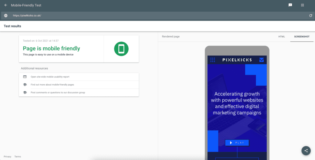
If you’re not too sure if your website is responsive or not, run your website through Google’s mobile-friendly test tool. You can test as many URLs as you’d like, and the results will indicate whether or not the page is mobile friendly, and what you can do to improve it.
5. Utilise tools for technical checks
Aside from the visual aspects and the analytical data which will point out any obvious flaws in your website design, it’s always a good idea to dig deeper and utilise tools that can look further into the technical optimisation of your site.
Here are two highly useful tools that can help to flag any errors…
Screaming Frog
Screaming Frog is an SEO spider tool made for the purpose of crawling website pages. By using this tool you will be able to ensure that each page is indexable and in working order both on desktop and mobile.
Under the configuration settings, the tool can be used to crawl a website using Googlebot (smartphone) to check for any pages or resources blocked by robots.txt.
Mobile indexing aside, Screaming Frog is useful for conducting regular technical audits of your site’s structure. It will flag errors such as broken links, no-index pages and SEO optimisation which may have been missed.
Each crawl puts the information into a report, that way any issues are listed in an easy to read format so you can find issues more efficiently. In addition to crawling sites you can also schedule an audit each month in order to ensure the site is correctly functioning and maintained for both desktop and mobile. By having a scheduled audit you can easily keep an eye on any internal errors that may need fixing.
Google Search Console
An incredibly useful, and most importantly free tool for any website owner, Google Search Console can be used to check for any internal errors that may be affecting the performance of your site.
GSC’s specific Mobile Usability tool will raise any mobile-specific issues that need fixing on the site. These can range from text being too small to read, to clickable elements too close together and if the content is spanning wider than the screen.
Within Google Search Console, you’ll also be able to check the usability of your website with the Core Web Vitals tool. A huge addition to Google’s latest algorithm changes, these metrics measure the performance of your website, drilled down into three different speed metrics. Here, you’ll be able to see the performance of your URLs on mobile compared to desktop.
Looking for a mobile responsive website? Pixel Kicks are a Manchester digital agency, specialising in the design & build of responsive websites with an SEO and user-experience focused approach. Get in touch with us to find out more.

