
Do you want to drive more conversions through your PPC campaign? Creating an effective landing page is the key.
For any business, spending money on a PPC campaign which generates a high click-through rate but falls short on conversion rate is ultimately a waste of budget.
You might have amazingly written, compelling ads but that’s not doing much for you if the conversions aren’t coming through. If this is the case, it’s likely that your landing pages aren’t up to scratch.
What is a landing page?
Landing pages are different to regular pages on your website, in that they are created specifically with one goal in mind – to generate conversions from an advertising or marketing campaign.
In comparison to any other page on your website which will usually contain a number of different internal links and features to encourage users to browse other content on your site, landing pages are purpose built around directing the user towards one single call-to-action relevant to your campaign.
Landing pages are typically only accessible via a direct link, whether that’s from within a marketing email or an advertisement on an online platform such as Google Ads, Facebook, Twitter, Instagram or any similar networks.
Do I need to create a landing page?
The simple answer to this is, no. Technically speaking, any page on your website can be a landing page, but if you want to get the most out of your campaigns and increase the number of conversions then spending a bit of time working on a goal specific page is optimal.
Chances are, you’ve got a homepage that perfectly showcases your brand and its offering, so you may be tempted to direct all of your traffic straight there. However, it’s important to bear in mind that by doing that, users are then free to navigate through your entire site, which can therefore take them away from making a purchase, signing up or making an enquiry.
By minimising all of the clutter that can come from a website homepage and streamlining your offering into a standalone page focused on the goal at hand, you’ve immediately increased your chances of customers completing the desired call-to-action, therefore resulting in a higher conversion rate from your campaign – and that’s what we all want, right?
The first step towards achieving this goal is to create a good, effective landing page.
What makes a good landing page?
There is no one-size-fits-all approach to landing pages, and it would be near impossible to find the ‘perfect’ landing page template and apply it to any campaign.
While all landing pages share the same conversion-driving goals, what exactly these goals are and how they are generated will be dependent on many differing factors such as target audience, brand and the desired action you want users to take.
This means that to really create the perfect landing page, you’ll have to put in a bit of time, research and possible A/B testing to figure out what works for you.
Fortunately, it’s not rocket-science and there are a few staple features of all good, persuasive landing pages which you should look at including to get it off the ground.
1. A clean design
Once a user has landed on your page, the first thing they will notice is the look and feel of the overall design, so first impressions count here. This plays a huge part in the effectiveness of any landing page.
As mentioned earlier, landing pages should be clutter-free. The main aim is to make it as easy as possible for users to convert, so the last thing you want to be doing is creating too many distractions on the page that may just take them away from completing the desired action. This means removing any pop-ups, providing only the necessary information to avoid overwhelming the consumer and keeping the navigation and links to a minimum.
A clean and minimal design is always favourable, and it’s generally best practice to pick out key bits of information and secure them above the fold. This will stop you from offering too much too soon and overwhelming the user with more information than they can handle. Ensure that the first thing they see is easy to digest, and reserve the more thorough descriptions for further down the page.
In short, organisation is the key here. You can’t beat a simple layout with easy to read and informative text, visually appealing videos/graphics and clear call-to-actions. Landing pages are perfectly suited to the phrase “sometimes, less is more.”
2. Consistent branding
You want to look at your landing page as a sort of stripped back version of your website. While landing pages should have a noticeably different look to other pages on your site in terms of having a simpler design, it’s crucial that they’re in-keeping with your branding.
Although it may be tempting to ‘go all out’ with your landing pages and produce a knock-your-socks off type of design to wow visitors, it’s important to stick to your brand guidelines. It’s likely that a lot of time and effort has been put into creating and promoting your brand, so you want it to be instantly recognisable to the consumer upon landing on your page.
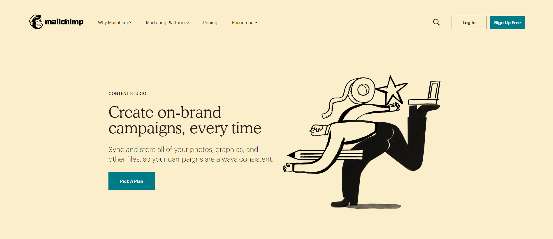
See Canva’s landing page below for inspiration:
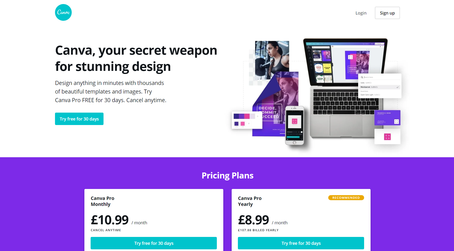
Ensure that your landing pages are consistent with your overall look by using the same colour scheme, typography, logo and creative elements as you would across your website and other digital properties.
Be sure not to overlook minor details such as a clearly visible logo and the same favicons across all pages in order to strike an instantly recognisable connection between your brand and the consumer.
3. Great visuals
While it’s imperative that the page has easy to read text and clear call-to-actions, don’t overlook the visual appeal that should be presented to the user. The human eye naturally gravitates towards visually attractive graphics, images and videos so your landing pages are a great opportunity to take advantage of this to further upsell your services.
Here are some of the most effective visual elements and how you can use them on your landing page to increase conversions:
Icons
Enhancing the way you display text on your landing page with the use of icons is a simple and effective way to engage the reader and draw their attention to key pieces of information.
They can either be used to emphasise an important section on the page alongside plain text, or even to replace what could have been written in text, with a more visually appealing representation of what you’re trying to say.
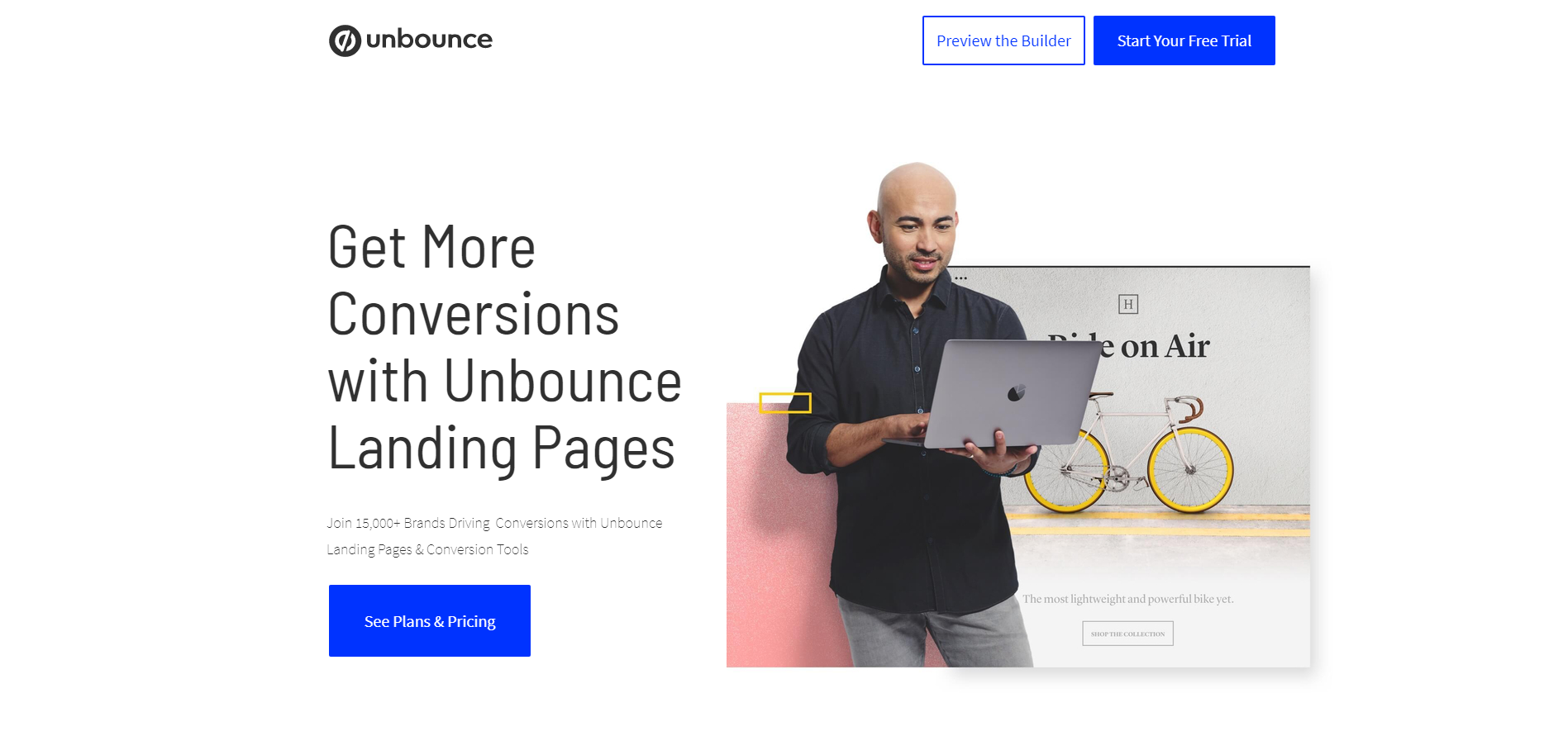
See how Unbounce have used icons to make their key benefits stand out:
![]()
Illustrations
Including illustrations or diagrams can be a great way to tell a story without being too text-heavy. They stand out and can make it easier for the user to take in a wealth of information all in one go.
Here’s an example from Freshworks who have utilised illustrations to their advantage to show comparisons between their software and competitors: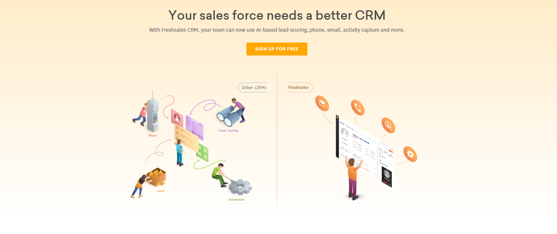
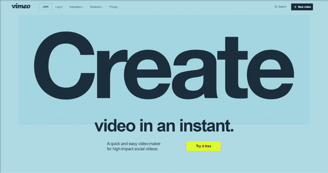
Videos & animations
Many of us can agree that upon landing on a web page, if we see something that’s moving – it’s hard not to watch. Animated graphics and videos are intriguing to say the least, as we’re programmed to want to see what’s next.
According to EyeView, relevant videos can increase conversions by 86%. It’s not a surprising statistic as videos are powerful pieces of content that draw the reader in, but it’s certainly one to bear in mind and take full advantage of whilst designing your landing page.
This example from Vimeo demonstrates perfect use of eye-catching and informative animations:
Images
Every high converting landing page includes images of some sort, as it’s no secret that images are a powerful visual component of just about any web page. However, careful consideration should be taken when choosing images for your landing pages, as they could make the difference between sales and no sales.
If you’re selling a product, including high quality shots of said product is a must. Give consumers everything they want to see. Sharp and crisp images that show it off to its full potential, the view from different angles and maybe even offer images of the product in different settings if relevant.
When promoting a service, choose relevant images that are powerful enough to grab the users attention and give them a reason to stick around to find out more. One thing’s for sure, this is the time where you want to avoid generic stock photos at all costs. Be original, and showcase imagery that complements your brand.
While consumers love to see great visual components, be strategic in your approach and ensure that they not only complement your design aesthetics, but are useful and assist in your goal to encourage users to take action.
4. An effective headline
You’ve already convinced your audience that your services are worth checking out with effective ads, but now you need to give them a reason to stay.
While you’ve already won the bidding war against your competitors, there’s no saying that you’ve secured your conversion just yet. The first thing users will see is the headline on your landing page, so you want to make it good.
By good we mean clear, straight and to the point. Fancy won’t work here. Keep it short and sweet, and to the point.
When looking to create an effective headline, you won’t go far wrong by ensuring that it includes these three main characteristics:
- Clarity – Describe exactly what you’re offering in a few words, don’t make the user try to guess what’s going on.
- Relevancy – Keep in mind what your ad text says. This is what enticed the user to your website in the first place, so make sure your landing page message matches what was promised in the ad.
- Empathy – People want to see that you’re a solution to their problem, so it’s always key to ensure that your headline addresses the issue, and offers them exactly what they’re looking for. Empathise with them, show them that you’re the answer to their prayers.
Now that you know the foundations of a strong headline, let’s take a look at the different ways that you can create yours:
Ask a question – You want this to strike a chord with the user, so present them with a question that both resonates with your audience and is relevant to your offering. Finish by writing the answer in the subheading and peak their interests by doing so.
Promote your unique value proposition (UVP) – What does your service offer that similar ones don’t? How will this benefit the consumer? Make sure this is the first thing they see, don’t be shy to let the user know what they’ll be missing out on if they don’t opt-in.
Include a statistic – If you’ve got some proven results from your software/service, now is the time to show them off. Adding value to your proposition via numbers in a headline such as “Improve your efficiency by 60% with manageable workloads” is almost a way of proving its worth, and a great way of grabbing attention.
Encourage an action – Promote your call-to-action straight from the off. This works particularly well if you’re offering a free trial. Start with how they will benefit from your software, and finish with “Start your free trial today”.
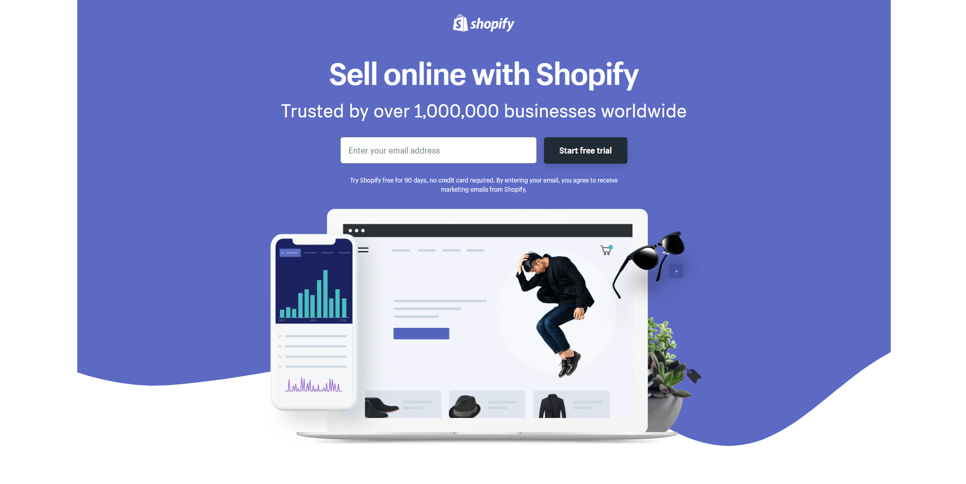
Start with a “how to” – Simple and effective, a “how to” headline offers consumers an instant solution to their problems. It doesn’t need to include the phrase itself, but it will simply state that what they’re looking for, you’ve got it. For example, those looking to find out how to start an online business may be greeted with Shopify’s straight forward headline “Sell online with Shopify”, followed by their statement of trust.
Creating the perfect headline might not always happen the first time around, so it’s a good idea to conduct an A/B test on your different options, and get a gauge of the conversion rates which follow.
5. Well written copy
Now that you’ve nailed down the design and layout of your landing page, it’s time to focus on the text. While you’re not trying to get your landing pages to rank for SEO, you are trying to convince the user that they’ve clicked on the right ad, and your products/services are exactly what they need.
The text on your landing page is your key to driving conversions. In order to get users to fill in that contact form, sign up for their free trial or buy your product, your content needs to be well written, persuasive and convincing.
Here are some top tips for writing effective landing page copy:
Keep it concise
Most users don’t have the time to spend scrolling down a needlessly long page and reading through paragraphs and paragraphs to find out the information they’re looking for. Keep your audience’s attention span in mind while writing your copy and stick to the important information without overwhelming them with unnecessary space filling text.
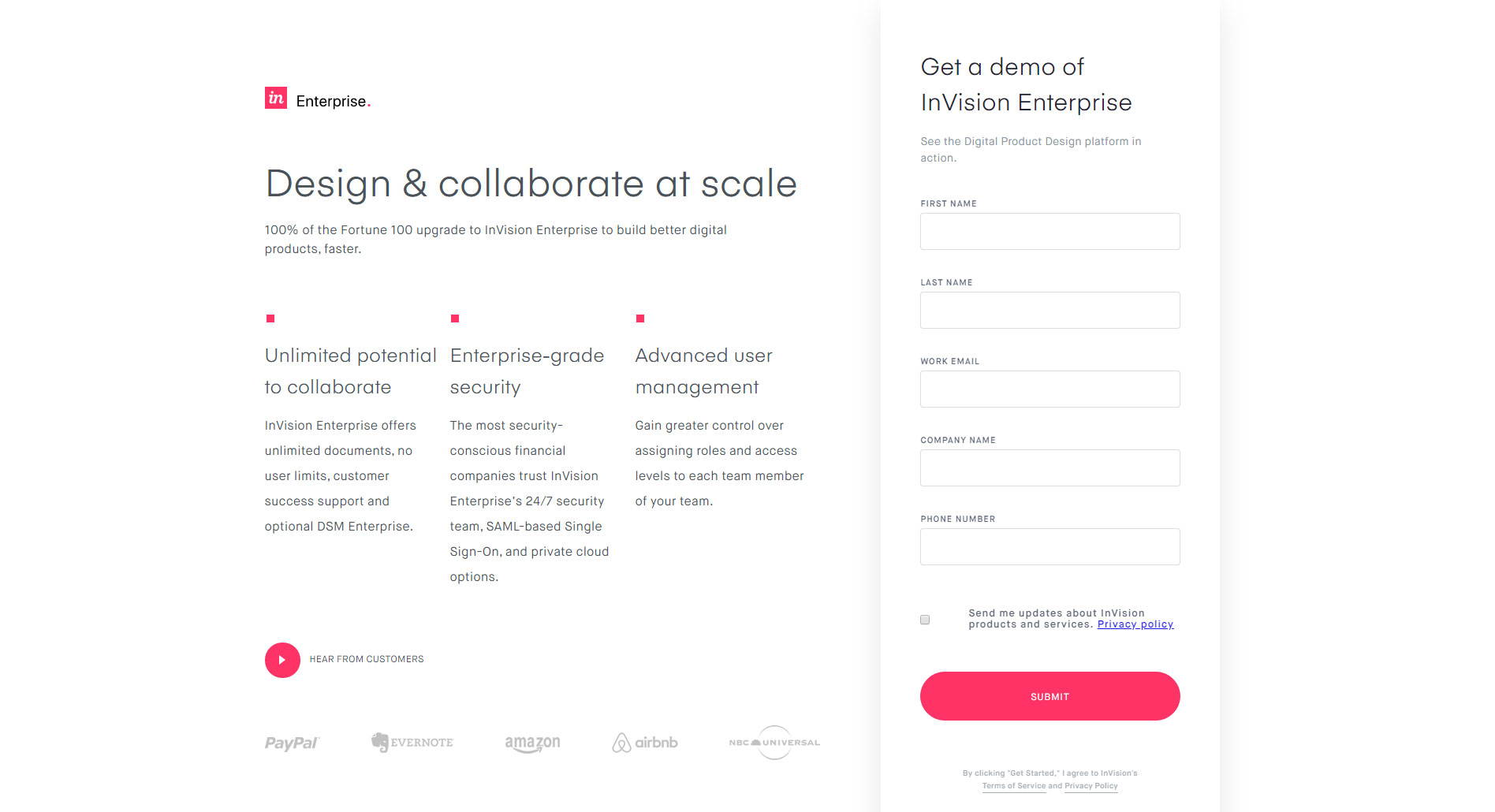
Here you can see that InVision include everything they need above the fold, without the need to scroll. While this isn’t necessary for everyone, it works well for some.
Keep it relevant
Don’t forget the user journey that it takes to find your landing pages – through your PPC ads. Take a look at your ad copy and apply the same language to your landing pages. You want to make sure that the customer knows they’ve clicked through to the right place, so keep it relevant to your ads.
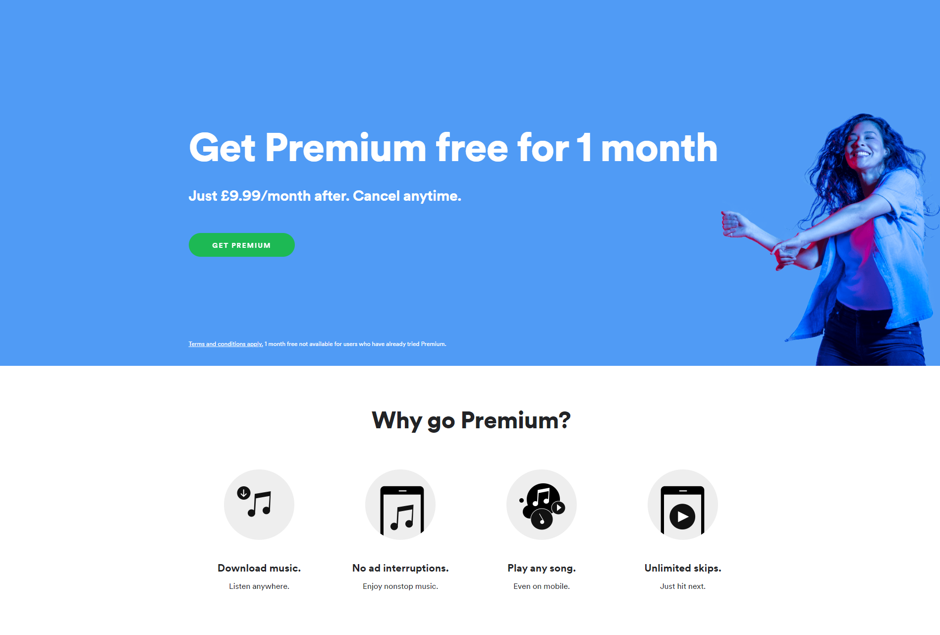
Promote the benefits, not the solution
This can be a tough one to crack, as it’s easy to want to push your products/service as a solution over and over again. However, if you’ve executed your ad copy and landing page headline properly, the user will already know that you’re offering a solution. Now, you want to focus on the benefits you’re providing. How are you doing it better than your competitors? Let them know what sets you apart from the rest.
A good example of this is Spotify’s PPC Landing Page which clearly emphasises the benefits of their premium service:
Be human
Promoting a brand doesn’t have to be all robotic language and big words. In fact, that’s usually a bit boring and not very engaging at all. Throw out the rule book, and write like a human. Use humour and be funny if relevant to your offering, just try to write with a more personal approach and you’re guaranteed to connect more with your audience.
Ask for conversions
“If you don’t ask, you don’t get”. The sole aim of your landing page is to drive conversions, and all of your copy should revolve around getting the user to take action. Sometimes us humans need to be told what we need to do, so it really is as simple as asking them to “buy” or “sign up” throughout the page.
With all of that in mind, make sure your copy is actually interesting and engaging. Try to steer clear from typical, generic content if you want to stand out from the crowd and give the reader something worth reading.
6. Clear call-to-actions (CTAs)
The sole purpose of a landing page is to make visitors convert. So, what would a landing page be without call-to-actions? If it’s not already apparent enough by now, it’s important to stress that call-to-actions (CTAs) are the most crucial element of any landing page.
Your entire landing page is geared towards drawing the visitors attention to your call-to-action, so it needs to be prominent. Don’t hide it away in the footer, don’t make users search for it. Make it one of the first things they set their eyes on, and make it big. They won’t find it if it doesn’t stand out.
Here are some top tips for creating a high converting CTA:
Use a button
Think of a button as a universally recognised conversion signal. It’s obvious to know what to do when you see a button, so this tried and tested CTA method is almost a foolproof way of driving an action. Now is not the time to experiment with different techniques, stick with the standard button and you won’t go far wrong.
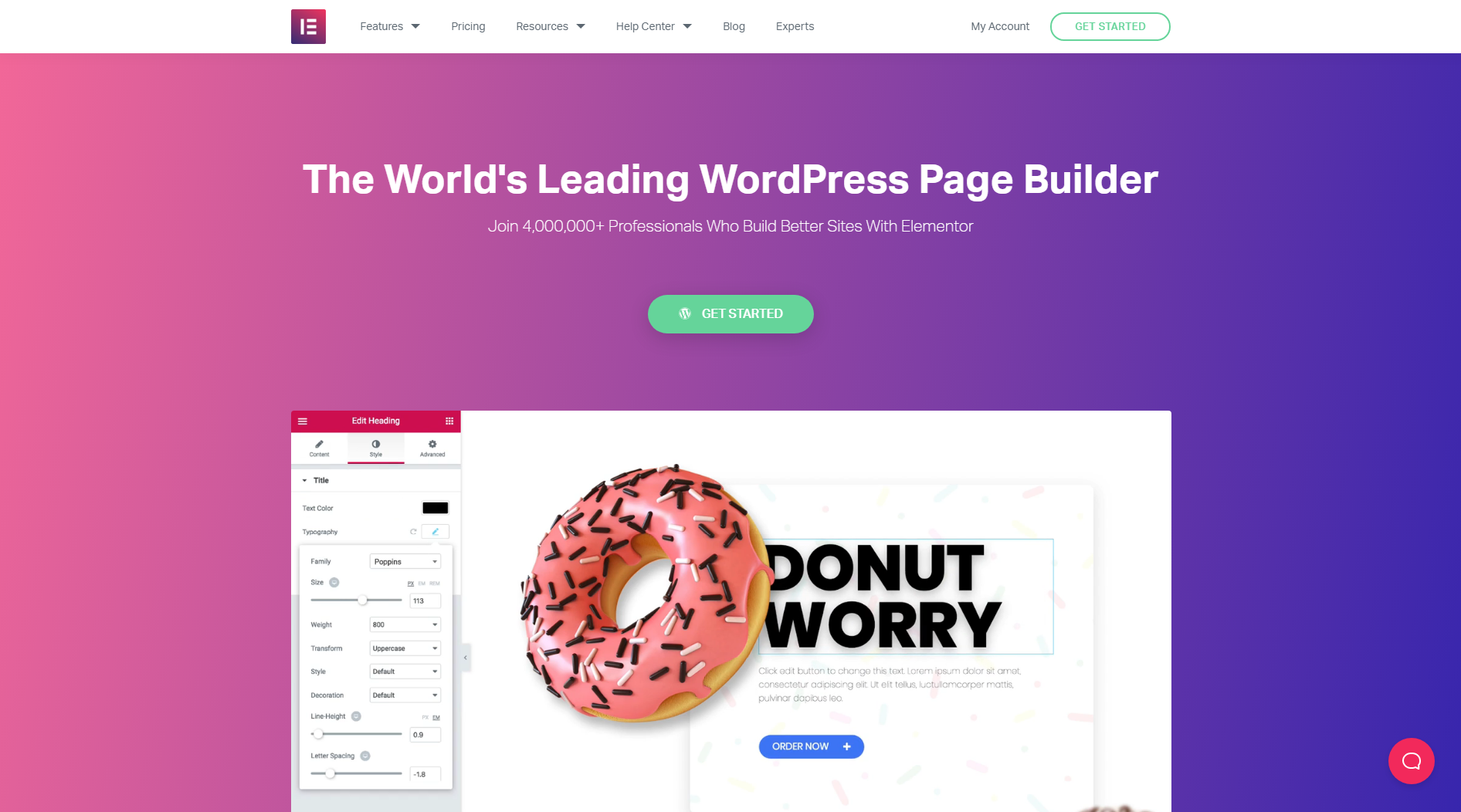
Make it stand out
Straying from your dedicated colour scheme is more than acceptable when it comes to your CTA. Buttons need to stand out, and by doing so that generally means making it a contrasting colour to the rest of your design. After all, it won’t be as visible if it blends in.
See the way Elementor chose a contrasting green colour to highlight their CTA:
Use compelling copy
Believe it or not, the actual text you add to your button is the most important copy that will sit on your page. Avoid using generic CTAs such as “submit” or “buy it now” and instead come up with an exciting and persuasive phrase or word that will make the user want to click.
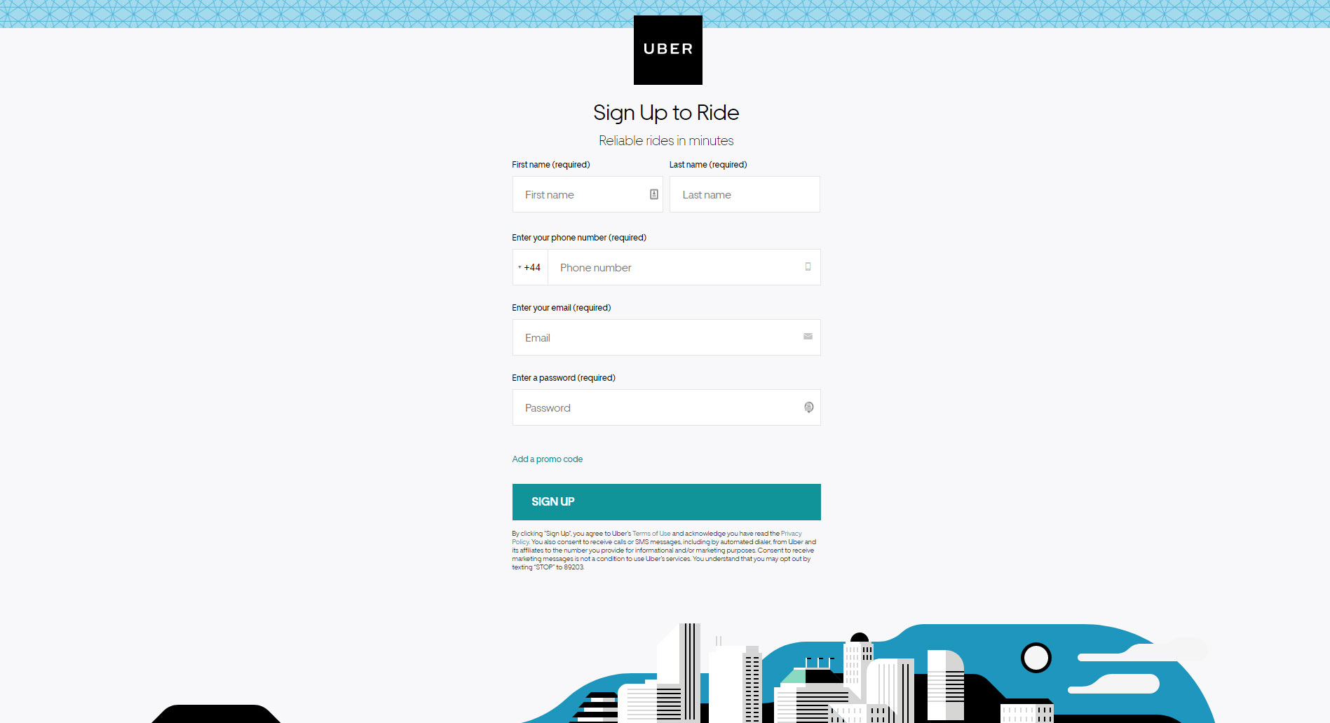
Keep contact forms short
It can be tempting to want to collect as much information as possible from visitors, but when the goal is to make them want to fill in the form in the first place, less really is more. Presenting users with a lengthy form can be off-putting, and make them less likely to convert. Stick to the minimum number of fields, and collect any further information you may need later down the line.
Uber’s landing page is a great example, requiring visitors only to fill out 5 fields of important information:
In short, your CTAs need to be bold and eye-catching. It’s simply not enough to have a great design and well-written copy if the user doesn’t know what action they’re supposed to take, or where they can find the form.
7. Add contact information
For a user, clicking on a paid ad and landing on a website unknown to them can sometimes make them a little wary of the legitimacy of the business. Of course, not everything is as it seems on the internet nowadays so this cause for concern is real, and completely understandable.
Don’t put visitors in a place where they’re searching for information on whether you’re legit or not, instead make it easy for them to see on your landing page.
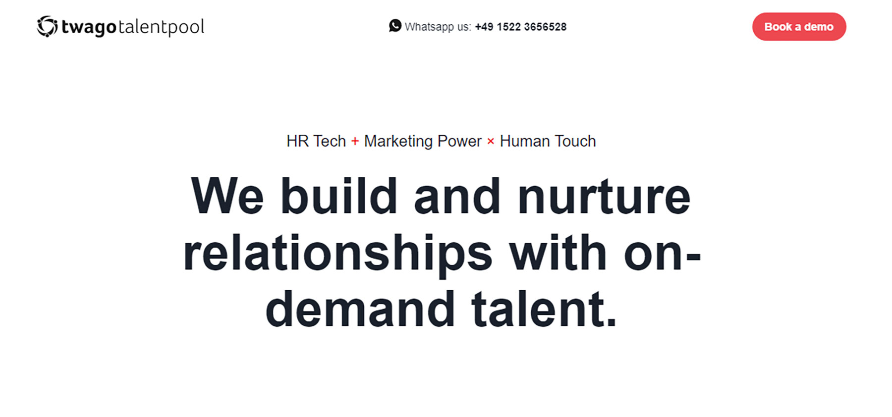
This is as simple as including methods of contact such as a phone number, a physical address, an email address or a contact form. These key pieces of information are powerful in reassuring customers that you are in fact a real company.
Twago Enterprise is a great example. Instantly you can see that they’re contactable via WhatsApp:
Essentially, beyond your call-to-actions, you’re looking to make it as easy as possible for users to get in contact with you, and should you provide a number of different methods of contact you may just secure a conversion that you wouldn’t have otherwise had.
8. Include Testimonials
88% of consumers say they trust online reviews as much as personal recommendations – BrightLocal.com.
If that doesn’t emphasise the importance of testimonials, then nothing will. Nowadays, many of us are hesitant about buying a product, booking a hotel or restaurant, or signing up for a service without checking out the reviews first. It’s human nature, but it just goes to show that for consumers, reading good or bad reviews can make or break their decision to take action.
With the trust that consumers instill in reviews, including testimonials on your landing page can be a great way of increasing conversions. Letting users read real experiences from real people can have a huge influence over their buying decisions.
For example, this is how Freshdesk utilise testimonials on their landing page:
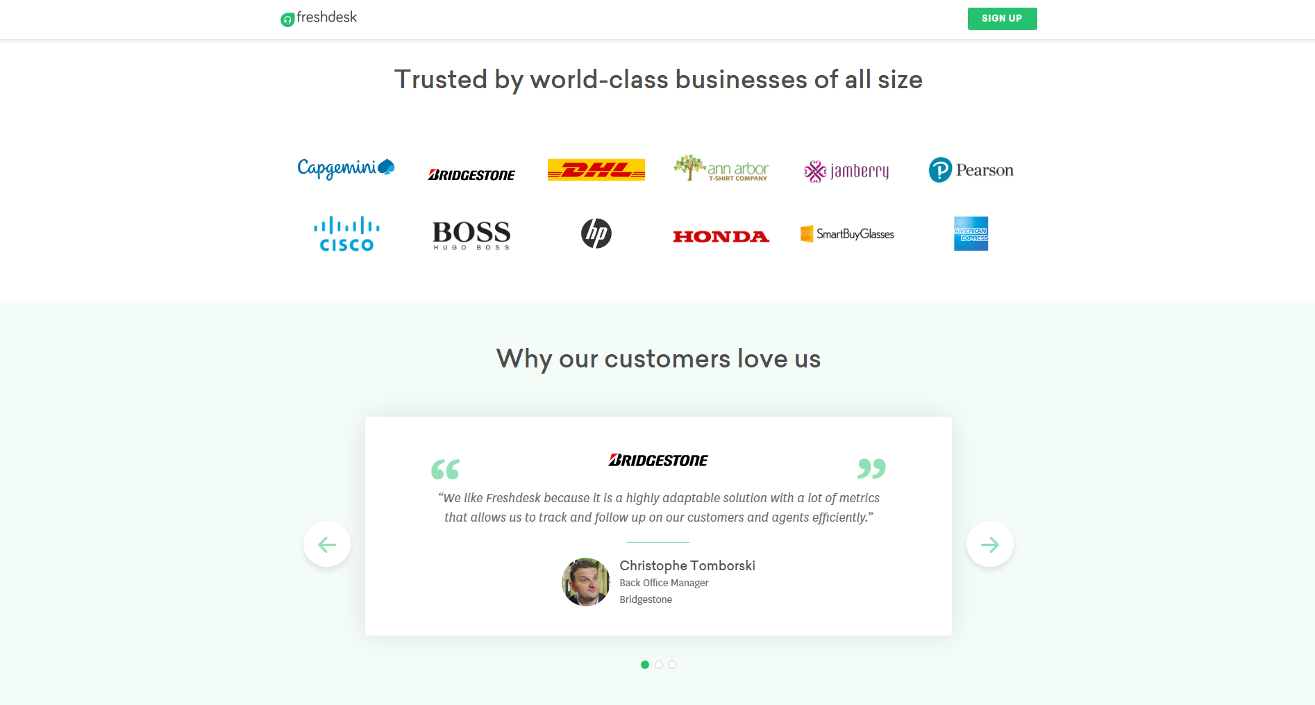
Consider either making them prominent on the page to shout about your rave reviews, or include a selection of quotes on a slider that users can scroll through at their own leisure. If there’s one thing you want to do with your landing page, it’s to help the user to make an informed decision to sway them towards converting and this seems to be a sure-fire way of doing so for many businesses.
Don’t forget, there is no ‘perfect’ landing page template. What works for one business might not work for another. However, by sticking to the basic fundamentals listed above, take the opportunity to test out different layouts, features and copy to see what works for you.
Looking for help with your PPC campaign? We’d love to hear from you. Give us a call on 0161 713 1700 or send us a message via our enquiry form, and one of our team will be happy to talk you through what we can do for you.
MORE LIKE THIS
VIEW ALLPixel Kicks joins PushON Commerce to accelerate growth
11th November 2025
Shopify for B2B Ecommerce: Features, pricing, and why it works
10th August 2025
What do Swiss mountains and project management have in common?
11th February 2025

Building an Accessible Website: Essential Practices for Developers
12th December 2024