

A balancing act
There’s a reason the vast majority of websites function in the same way – because it works – and it’s pretty much what the user has come to expect when they land on one. In today’s digital climate of fast-paced transactions and short attention spans it would be wrong to assume people have time, or are even interested in trying to decipher a cool but mental (unconventional) interface. They’re more likely to take two clicks back and find somewhere safe and familiar.
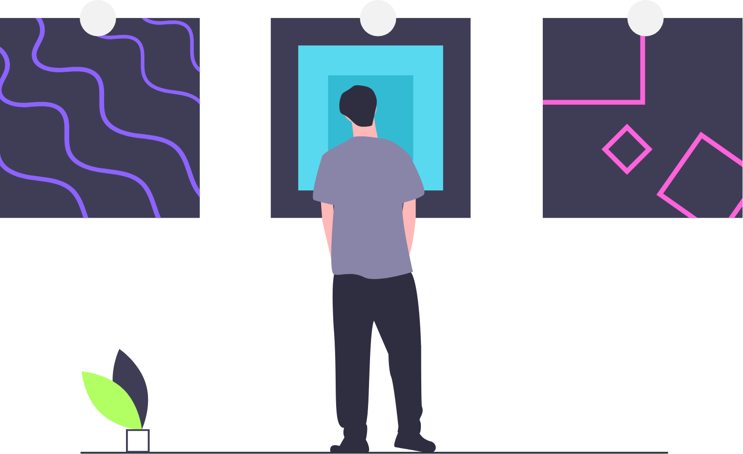
But we all want to be creative. To push the boundaries of how a site can work and what people will click through to get to where they want to go. After all if we didn’t progress with web design then we wouldn’t be where we are today, pushing the boundaries of design is what it’s all about. Creating something that leaves an impression and sets a website apart from its competitors is much more appealing than the alternative: something bland or ‘meh.’
So, striking a balance where form doesn’t have to follow function, but where creativity and usability can be the best of pals, and not compete with each other over the affection of the beloved user. Creating a website that looks like the cat’s pyjamas and is easy to use for the casual browser amongst us is the place we all need to strive towards.
How, you ask?
Time for a random analogy.
Think of your website as a high street shop.
You have the nice stuff on display in the window to show the punters what you’re all about, maybe throw in an exciting display and some bright colours to attract the eye for good measure.
If you’ve lured a customer inside then you can let your products do the talking. Making everything as easy to see and reach as possible, clearly marking prices and putting a massive neon sign above the checkout desk is often a good recipe to make sure your customer doesn’t get lost or distracted on the way to closing that sale. If you alternated from this and tried bamboozling your customer by putting in a trap door to the basement for fun, then you might find they never return.
The same can be said for a website’s user journey.
If you are lucky enough to have traffic on your website then don’t go overboard just to be different. A fancy menu system and animations that aren’t the norm are impressive when they serve a purpose, just don’t lead the user down the garden path with over complicated design. Instead hold their hand to guide them to where they need to be and get that conversion rate you’ve only dreamed of.
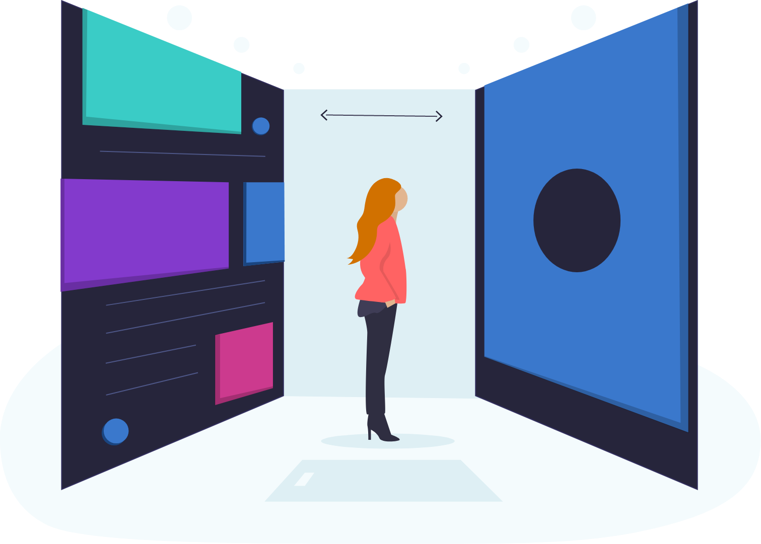
Choose a direction
Something that should really influence whether your approach to a new website is progressive or pragmatic is looking at the demographic and its potential user base.
If you’re looking to redesign the latest social app for tech-savvy millennials then there’s a lot more room to be creative with your execution than if you were working on a big e-commerce platform that will be used by a wide variety of people, where straight forward functionality and funnelling that user to the right place is the primary aim. It’s really all about designing with the right people in mind and not just for yourself, to keep up with the latest trends.
Getting back to the argument of being creative and experimental with digital products or being safer and familiar, it is also worth thinking of the desired outcome you or your client wants when people use it. If the aim is to sell a product then has this been done effectively? If the aim is to tell a story then do you take your user on that journey in an interesting and engaging way? Effective design is all about asking the right questions and getting the right answers. If you don’t pick the right route for the problem then your new site won’t be as good as it can be.
So keep it usable…
The user should be at the heart of how your website should function.
Design compliments content. It should be uncomplicated and unrestrictive in order to work effectively. Implementing a new design system or interface that goes against the grain is bold and will work so long as it’s intuitive for the user.
Thinking about your users’ needs and their journey from A-B is key, so it should be as simple and as frustration free as it can be. I always keep the KISS acronym in mind when planning out a new website (in the voice of Dwight from the Office).
It doesn’t matter what the website is for or who the target user is, I always have the same design principals in mind.
MORE LIKE THIS
VIEW ALLPixel Kicks joins PushON Commerce to accelerate growth
11th November 2025
Shopify for B2B Ecommerce: Features, pricing, and why it works
10th August 2025

What do Swiss mountains and project management have in common?
11th February 2025

Building an Accessible Website: Essential Practices for Developers
12th December 2024