In today’s world there’s no better way to reach potential customers than online. Any business that’s serious about making their brand a success should be focusing on their digital efforts, and one thing that should come top of that list is building a high performing, conversion-generating website.
For potential customers wanting to find out more about a business, buy one of their products, or book in for a service, you can bet that their first port of call will be to head directly to their website. The first thing they will see upon landing on the website, is the homepage.
We like to view a website’s homepage as a sort of digital business card. It’s the first impression that a customer will get of your brand, so it’s absolutely crucial that it ticks all of the boxes.
We recently touched on the essential features of a high converting landing page, but as this doesn’t apply to businesses that aren’t investing in PPC, we thought it necessary to outline the fundamentals for creating the perfect website homepage.
What makes a good homepage design?
While you might be hoping for a short and simple answer to this, there is unfortunately no quick-win when it comes to creating the perfect homepage.
There are many factors to consider that extend far beyond the general design and layout, in order to get your homepage doing what it’s meant to do – turning visitors into customers.
In this blog, we have detailed the most crucial design and functionality elements needed to create a visually appealing, lead-generating website homepage.
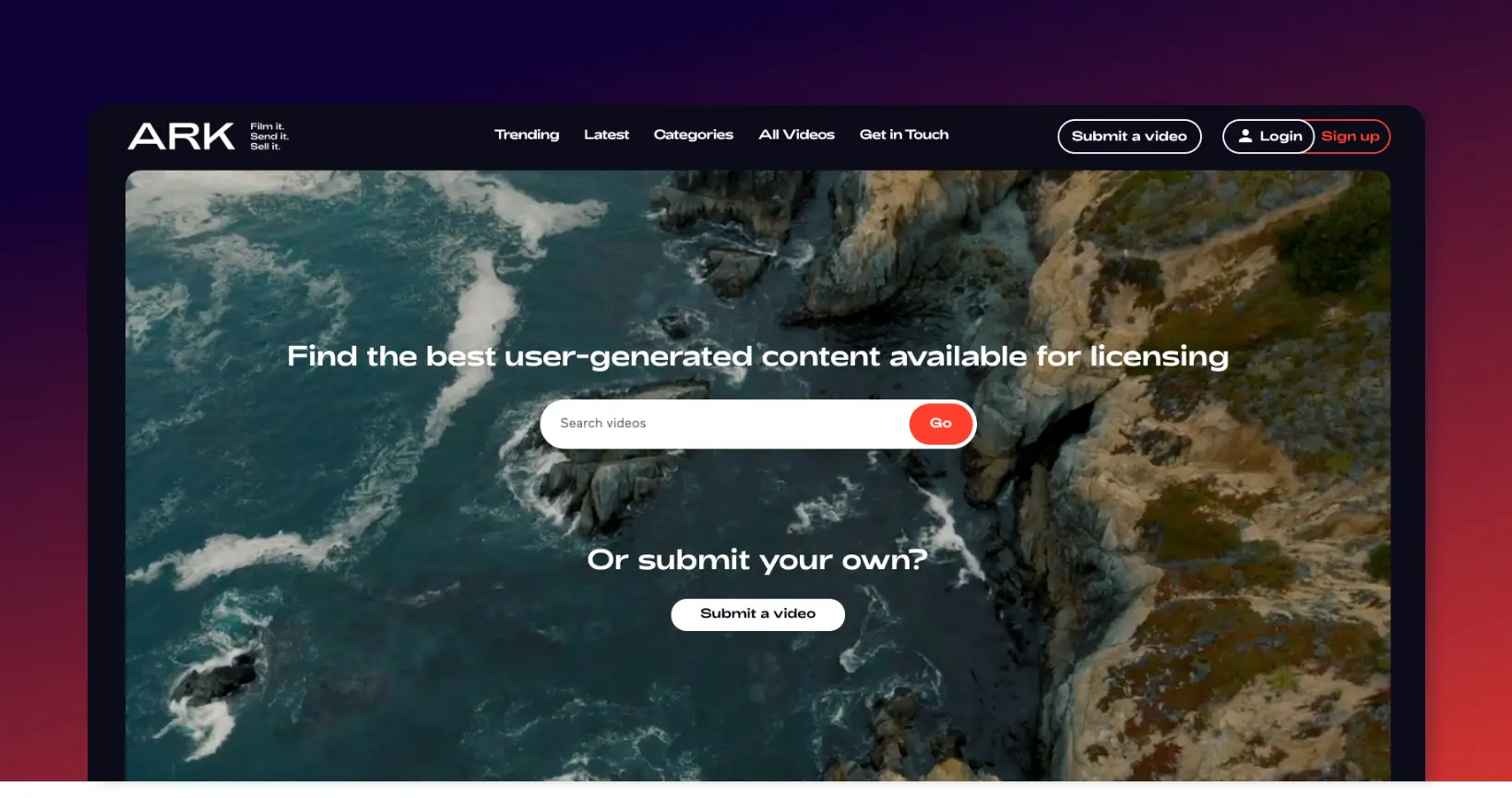
A menu that is easy to navigate
As websites continue to evolve and push boundaries, we are seeing more projects opt for full-screen menus instead of the traditional header navigation. Just click on ‘Menu’ in the top left corner to get an idea of what we mean! It encourages engagement with the site structure and provides a refreshing user experience.
Now that’s not to say that the conventional header is going to become redundant over time, in fact they are still as effective as ever. There has to be a balance between creativity and usability in design, and that’s something our Head of Design, Dan Parr, goes into in his recent post.
The primary purpose of any website header is to provide an easy navigation system for users and as long as you provide users with the ability to browse your website efficiently, you’re all set without which they may become frustrated as they cannot find what they are looking for.
Focus on the top level of your content first, these pages should be the ones that are displayed in the navigation itself. From there, you can implement dropdown functionality to display subpages that fall within that section.
Just remember, whatever you choose to do with your site navigation needs to be completely responsive for mobile. Take a look into mobile hamburger menus for more information on this, they condense your navigation down into a mobile-optimised version of your desktop offering.
Using the extra space to your advantage
As discussed, navigation is kind when it comes to the website header and menu – but that doesn’t mean you can’t weave in a secondary function into your design. Here are few common additions to website headers:
Showcasing your reviews
For reviews-led businesses that rely on customer opinion and testimonials, you may wish to showcase your overall rating on websites like Trustpilot. Linked to your reviews page, it is a simple and effective trust indicator that can go a long way towards persuading a user to make a purchase.
Primary call to action
What is your website supposed to be doing for you? Generating sales, enquiries, phone calls? In your header there is an opportunity to place a distinct button that encourages users to do exactly that. Sometimes, users will arrive on the site with the intent of getting in touch – so having a button that takes them directly there is simple and effective UX.
Contact details and address
Perhaps your website is there to generate footfall to a particular in-store location, particularly if you offer a service that is performed in person. It’s something we have come across frequently in the health sector, so having your contact details and address ready and waiting – again, it just helps users to get that key information quickly.
Search functionality
If your website is an ecommerce store and you have an extensive catalogue of products, you may wish to add a search bar function to your header. This helps users to browse your stock quickly to find what they’re in search of.
An eye-catching slider or banner
It’s key to think about what a user will be greeted with when they land on your website. Everything that appears above-the-fold on your homepage plays a crucial role in whether or not a site visitor adds to your bounce rate, or becomes a potential customer.
As such, it’s important to carefully consider what information you choose to display, with this being something that can heavily affect your conversion rate.
A slider or a banner?
One of the best ways of ensuring users are given some key information and eye-catching imagery is through the addition of a slider or a banner. But which should you use?
A static banner is perfect for sites that have one key message they want to display. It can serve as a brief introduction to your website, or as a call-to-action to a page you want customers to navigate to.
A slider however is great if you have multiple messages you want to push. Whether it cycles through slides automatically, or is operated by the user, it enables you to vary your primary content – it means you can put multiple products, offers or selling points at centre stage, rather than having to focus on just one.
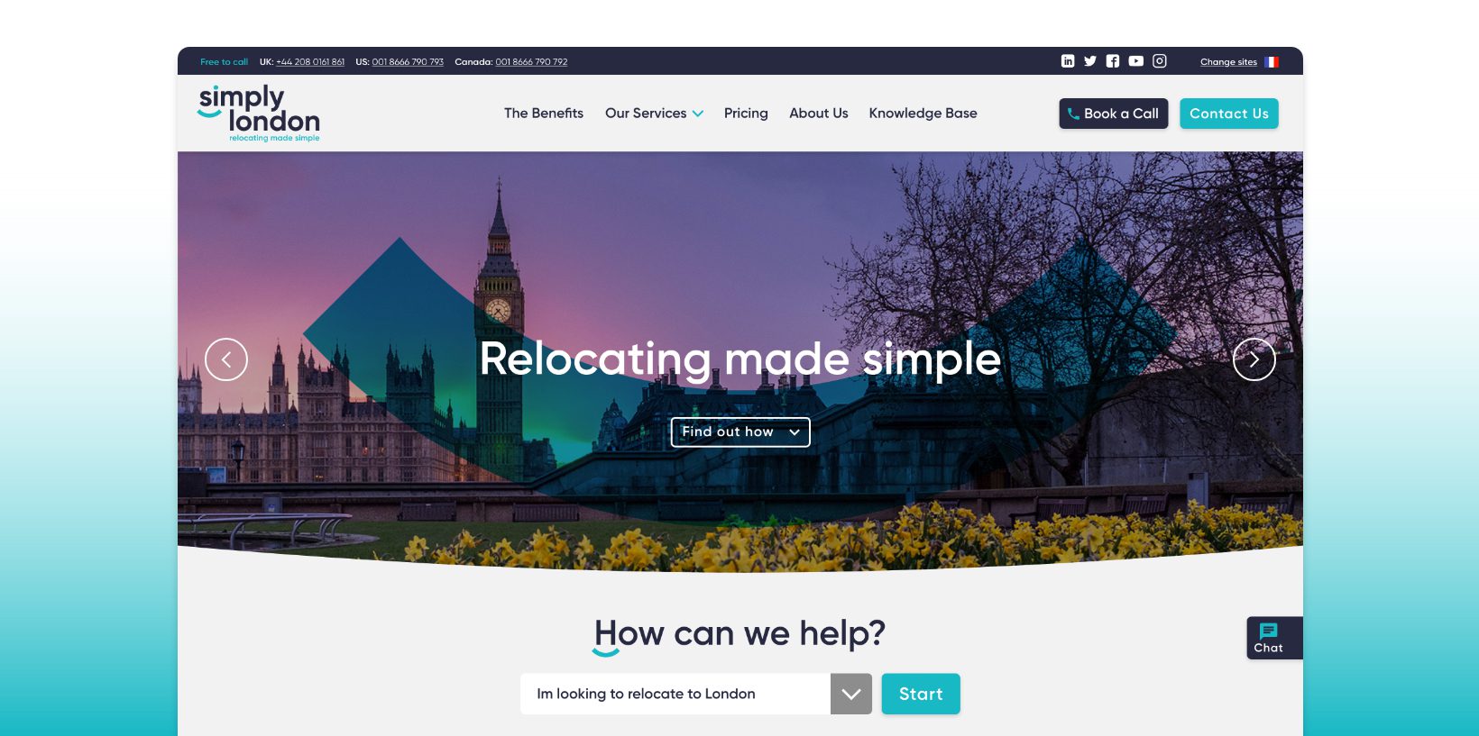
What to include on your slider
Keeping in mind that the content of your slider is likely to be what gives the crucial first impression of your business to users, it’s important to get it spot on.
You need to think about how you want your business to be seen by potential customers, with this being an important part of creating the imagery and copy.
You should include high quality, eye-catching imagery, whether this is an advertising graphic or product photography. As well as highlighting the key selling points of your business and product, it’s also pivotal to include clear call-to-actions, whether you want to encourage people to click through to a specific page, purchase a product, or make an enquiry.
The copy on your homepage can have a big SEO impact
When building your homepage it is just as important that you create it with your artificial audience in mind, as well as your human viewers.
What do we mean by this?
Well we’re not writing to please SkyNet, but we do have to take search engines like Google and Bing into account. We are of course talking about SEO.
As your homepage is the first page that a search engine will view when deciding where to place your site, it is vitally important that you make who you are and what you can do obvious from the outset. This means having a good density of text on your homepage (at the very least 200 words) containing your most highly valued keywords.
Now, this isn’t us saying have 500 words above the fold with keywords repeated over and over again as this will actually prove to be detrimental to your search rankings, but having the content neatly and comfortably spread out throughout the homepage will help you to reach those all important top spots.
You should also remember that there are smaller opportunities for getting text onto the homepage hidden in plain sight behind some of your most important features: pictures. Using your homepage imagery’s alt texts to sneak some extra text onto the homepage is a great way to boost your overall word count without taking away from the visual aesthetics. But be warned, alt texts are not for spamming, and should be relevant to the images they are attached to!
Throughout your homepage you will need to remember to properly organise your text using heading tags, as this will make navigating the page much easier for a search engine’s crawler. As these tools read through H1s, H2s, H3s and so on, you need to make sure that your keywords are located in these areas and in arranged in order of priority (your most important keyword preferably being within the H1 tag). Doing so will make a noticeable difference in your keyword visibility.
The general design and layout of the page
With your homepage design optimised for the robotic viewer it’s time to pay some more attention to the organic visitors to your site, to whom the visual layout is far more important! As we have already mentioned above there are a multitude of features you should be employing to greet your visitors, but what about after the fold, as they scroll through your newly created homepage?
Where search engine crawlers navigate a page by descending through its heading tags, the human eye needs directing through the organisation of your visual features. This means creating an easy to follow path that still looks good.
The best place to start is to remember that the vast majority of your viewers will read from left to right. This creates the tendency for the eyes to always move left to right, and top to bottom. This is evident in all things visual, like photography, with the advanced rule of thirds directing the viewer’s eye through the image in a spiral from left to right. So how can you employ this on your homepage?
When setting up the page for desktop viewers, remember that they will more than likely be viewing the page in a landscape format, and so will therefore have a large lateral space to scan with their eyes. You can help them by making your first piece of content appear in the top left corner of the page after the fold, and the following piece appear below it and to the right. This arrangement naturally draws the eye, and helps your viewer to quickly navigate between the two pieces of content.
From here you can choose to repeat the process, starting again on the left hand side. This creates an alternating effect which plays right into that all important reading technique of left to right, top to bottom, and helps the viewer to take in your homepage easily.
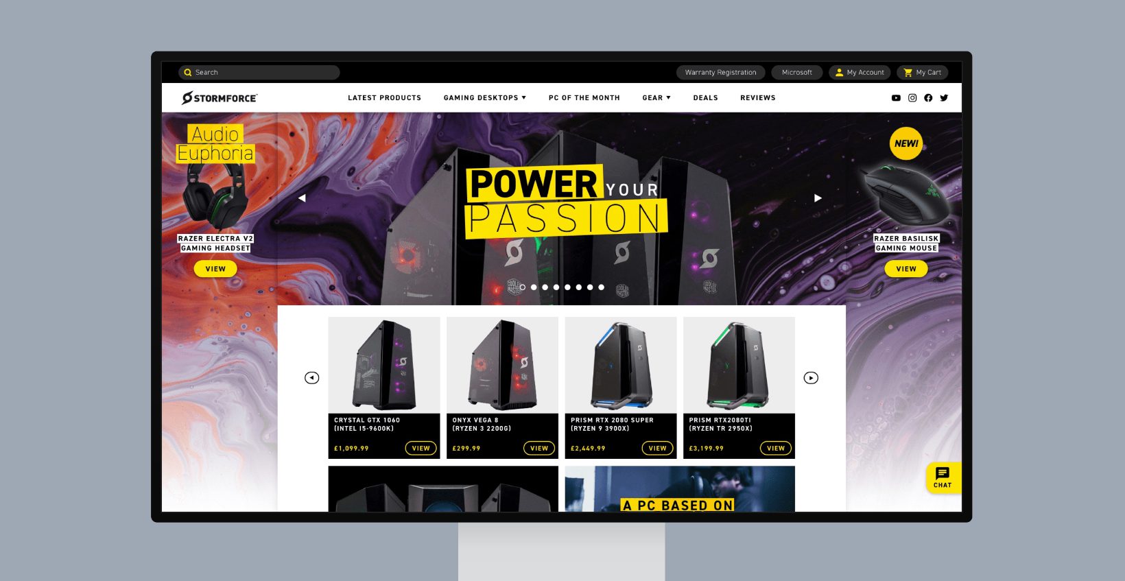
With your layout laid out, you can then start to employ other means of directing your viewers through the homepage. A great way of doing this is suggestive shapes that also reinforce your branding. Take a look at this example from a website we created at the end of 2019:
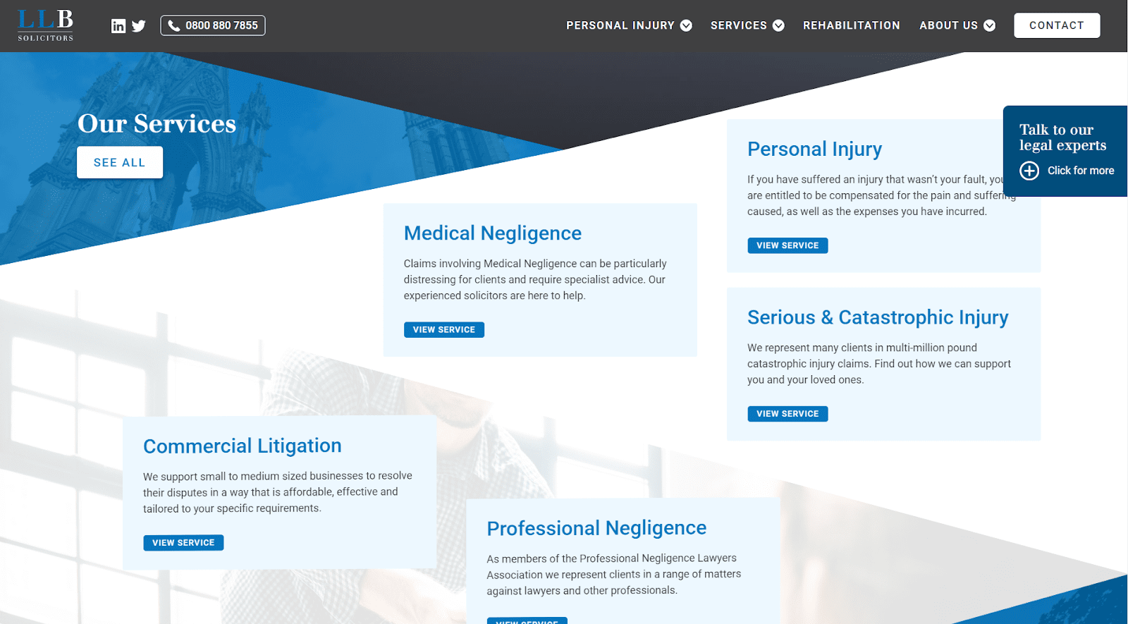
On this homepage the content was arranged in a left, right, top, bottom format, but using large arrow-like triangles to actively point the viewer to their next block of content. This, combined with an alternating pattern of colours aligned with the company’s branding makes for a pleasurable to use and truly distinctive homepage.
But what about for mobile users?
Mobile browsing has quickly overtaken desktop as the primary way in which websites are viewed in an alarming fashion, meaning now all websites, and homepages, must be optimised for their use!
Luckily for the design of your website mobile viewing is somewhat “lazier” than desktop, as the left to right element is drastically reduced in favour of top to bottom scrolling. This doesn’t mean you can’t make your homepage easy to navigate though.
Using colour to differentiate each block is a great way to keep the viewer’s eyes engaged, and avoid the dreaded “wall of text” aesthetic that is proven to deter people. Should this not be enough, you can also use text alignment to your advantage as a way of shifting the weight of a paragraph from one side of a homepage to another. This understated method helps to recover some of that alternating pattern we relied on so much on the desktop homepage, without making the text itself hard to read.
Your imagery should also be reconsidered for mobile viewers, as the change in screen orientation will mean that landscape images suddenly become much harder to see, and can lead to a text, image, text, image cycle that gets a little stale. To avoid this, why not try getting adventurous with your format, and using overlaying and offsetting to structure your content in an attractive manner?
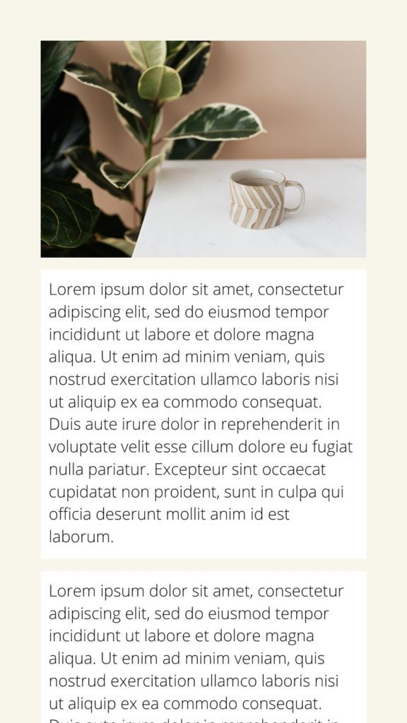
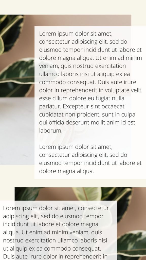
In this example the content is spread throughout the page with the emphasis being placed upon the text, but with the imagery still providing colour and making the page appear much more attractive.
All of these measures combined will make for a website that just flows, and will perform well both with search engines, and with those who can appreciate the artistry of your design.
Where should you link to from your homepage?
While a visually appealing homepage is exactly what every website should be aiming to achieve in order to make an impression on first time visitors, the design isn’t the be all and end all. In order to add value to your website for both users and Google’s search engine bots, you want to think about what else you can showcase from the get-go.
Ideally, you don’t want to rely on users only using your main menu to navigate around your website. By simply factoring in sections to your design which direct to other internal pages, you’re offering them the opportunity to explore your website and putting the content that you want them to see, right in front of them at first glance.
Depending on your website’s main objectives, this could be anything from including a key services section, to showcasing the most popular shopping categories and everything in between.
Your latest blog posts
If you’re dedicated to your content marketing, there’s a good chance that you’ve got a thriving blog section on your website. If this is the case, you don’t want to be hiding your content away.
By adding a simple feed of your latest blog posts to your homepage, you’re not only showcasing your knowledge and expertise to the user, but you’re avoiding having a completely static homepage.
Google’s search bots work their magic when pages are updated, so when you add a new blog post to your website, this will automatically refresh your homepage’s content and indicate that a re-crawl is needed. This is a quick and simple, yet effective route to regularly improving your rankings.
Your case studies or your portfolio
For businesses selling a service, showcasing previous successes is key. Users want to see what you’ve done in the past and what you’re capable of doing, which can translate into what you can potentially do for them, too.
Look at including a section dedicated to in-depth case studies or even a simple portfolio of some of your best work. Don’t shy away from showing off on your homepage, it could just be the one thing that turns a visitor into a lead.
Your core services
Any good service-based website will include a section dedicated to their core services on their homepage. The idea behind this is that you don’t want to leave the user wondering “what services do they offer?”, make sure they’re highlighted at first sight.
Depending on how many services you offer, this doesn’t have to be an exhaustive list which takes away from your homepage’s intentions. Instead, pick out a few of your core services and link to them along with your dedicated ‘Services’ page for more in-depth information.
Your shopping categories
For eCommerce businesses, providing the user with quick and easy access to the categories they want to shop is a fundamental part of the user journey.
In order to make this as effective as possible, consider placing your browsable categories section within the first half of the page and accompany each one with easily identifiable images that perfectly depict the contents of each category.
…and finally, no website is complete without a footer
Including a footer on your homepage is essential for any brand new website. Not only does it look attractive to users viewing the page, but there are many benefits to having one that will improve the usability of the site.
Users need to find the important information they’re after in a few clicks, so by including the relevant information in the footer this will give them exactly what they need, quickly. In doing this, it will increase the chances of the user becoming a regular customer.
When creating a footer it’s also important to consider the users’ expectations. The footer can always include additional functions and content so it makes the users experience that much better. Adding a contact form to the footer means that the user doesn’t have to keep scrolling back up the page to find one, or other certain content that they are looking for. This will further impact on their impression of your website.
If you need help with your homepage, and your wider website on the whole, why not get in touch with us today? From design to development, we are perfectly positioned to work with you on your next project.